
PROJECT OVERVIEW
ITV Media is a growth engine for businesses and brands, enabling them to build presence and scale across broadcast TV, on-demand, social, and YouTube. It supports organisations of all sizes - from global brands to local independents - through a broad range of advertising solutions, including traditional TV advertising, programme sponsorships, and digital campaigns on ITVX.
This project aimed to deliver a full redesign of the ITV Media website, transforming it into a modern, high-performing digital service aligned with both client needs and ITV’s commercial objectives. The new platform should introduce clear, persona-led user journeys, significantly streamlined and modularised content, and use a refreshed visual design that reflected ITV’s consumer brand.
The site was to be restructured to act as a central information hub, providing accessible resources to support customers’ marketing and sales planning. Built on a flexible and secure CMS, the solution reduced ongoing maintenance effort and cost inefficiencies, while ensuring the platform evolves with future business and marketing needs.
PROBLEM STATEMENT
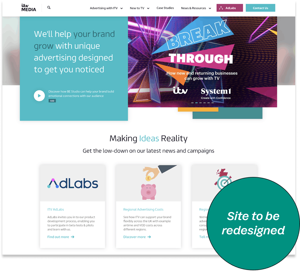
The ITV Media website is not effectively supporting the needs of its diverse user base, which ranges from global brands to local advertisers. User journeys were unclear and not tailored to distinct personas, making it difficult for users to quickly understand relevant advertising opportunities or progress confidently through the site.
The information architecture and content structure were fragmented, preventing the site from functioning as a clear, trusted information hub for marketing and sales planning. Visual design no longer aligned with ITV’s consumer brand, weakening credibility and engagement.
From a UX and operational perspective, the platform lacked a modular, scalable structure and relied on a CMS that was difficult to manage, resulting in high maintenance effort and cost inefficiencies. These issues limited the site’s ability to evolve with user needs and business goals, highlighting the need for a redesigned, persona-led, and flexible digital experience.
OBJECTIVES
- Redesign ITV Media to be a high functioning, modern service which attracts it's clients.
- Improve user journeys with focus on personas.
- Update design to reflect consumer branding.
- Streamline the content.
- Act as an information hub with resources to support and inform our customers marketing & sales plans.
- Templated, modular design.
- Ensure the site is low maintenance, flexible, secure and employs an easy to access and use CMS.
- Remove the current cost inefficiency.
DELIVERY MILESTONES
USER RESEARCH
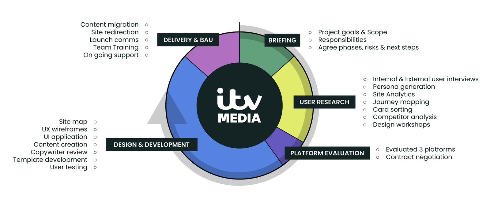
The research phase combined qualitative and quantitative methods to build a clear understanding of user needs, behaviours, and challenges across the ITV Media platform. Activities included internal and external user interviews, persona creation, journey mapping, card sorting, competitor analysis, site analytics review, and collaborative design-led workshops.
One-to-one interviews were conducted with both internal stakeholders and external users to understand how the current service is used in practice. These sessions explored user goals, needs, motivations, and frustrations, helping to identify key pain points and areas of opportunity across the user journey.
Top-level analytics were reviewed to uncover usage patterns, behavioural trends, and friction points within the existing site. This quantitative insight supported and validated the interview findings, ensuring decisions were grounded in evidence rather than assumptions.
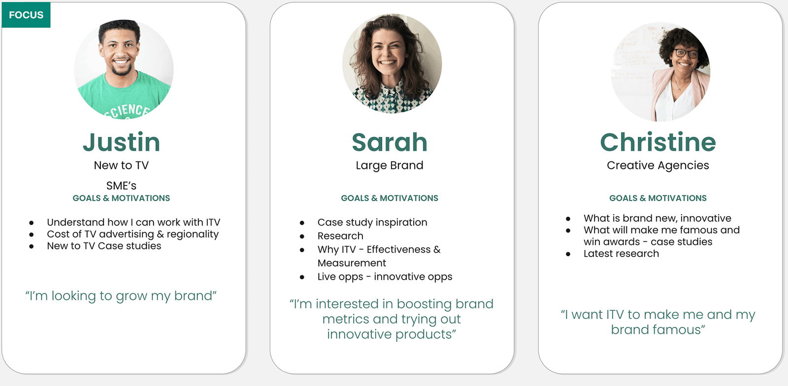
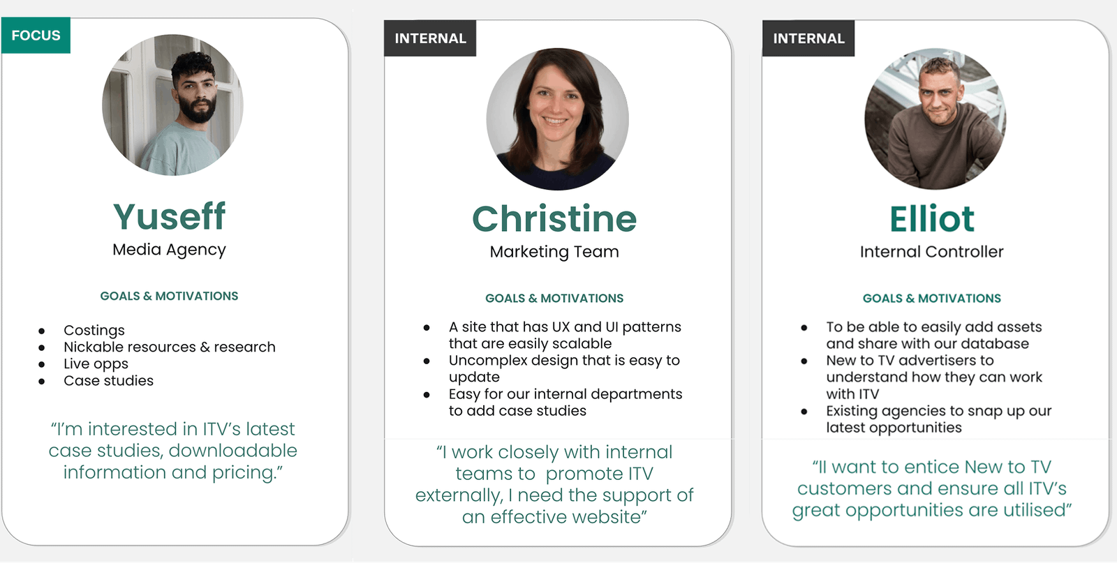
Key themes were synthesised from the research to inform design direction and prioritisation. Personas were developed to represent the main user groups, clarifying roles, motivations, and needs, and providing a shared reference point for the wider team. This research phase defined the core problem areas, highlighted opportunities for improvement, and established clear next steps and problem statements to guide the design phase.
OBJECTIVES
- Understand how both internal and external users currently interact with the ITV Media platform.
- Identify user needs, behaviours, motivations, and pain points across the end-to-end journey.
- Gather qualitative and quantitative insights to inform evidence-based design decisions.
- Analyse high-level site analytics to uncover usage trends, engagement patterns, and friction points.
- Identify recurring themes and opportunities to guide design direction and prioritisation.
- Create user personas to represent key user groups, clarifying roles, goals, and motivations.
- Define clear problem statements and next steps to support a user-centred design phase.
KEY INSIGHTS
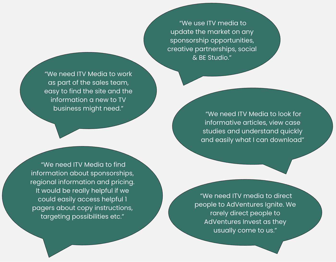
High-Value Assets: The platform holds a vast library of case studies, 1-pagers, webinars, and research, but needs to make the right elements stand out.
Agency Dependencies: External media agencies rely heavily on the site for downloadable assets, targeting possibilities, and regional pricing.
Onboarding Friction: New-to-TV advertisers do not know how to get started, highlighting a need for easy, persona-based navigation.
Core Offerings: Users explicitly visit the site to track sponsorships, latest opportunities, and content from specific hubs like BE Studio.
Directional Focus: Internal teams frequently need the site to route users towards specific growth areas like AdVentures Ignite.
PAIN POINTS
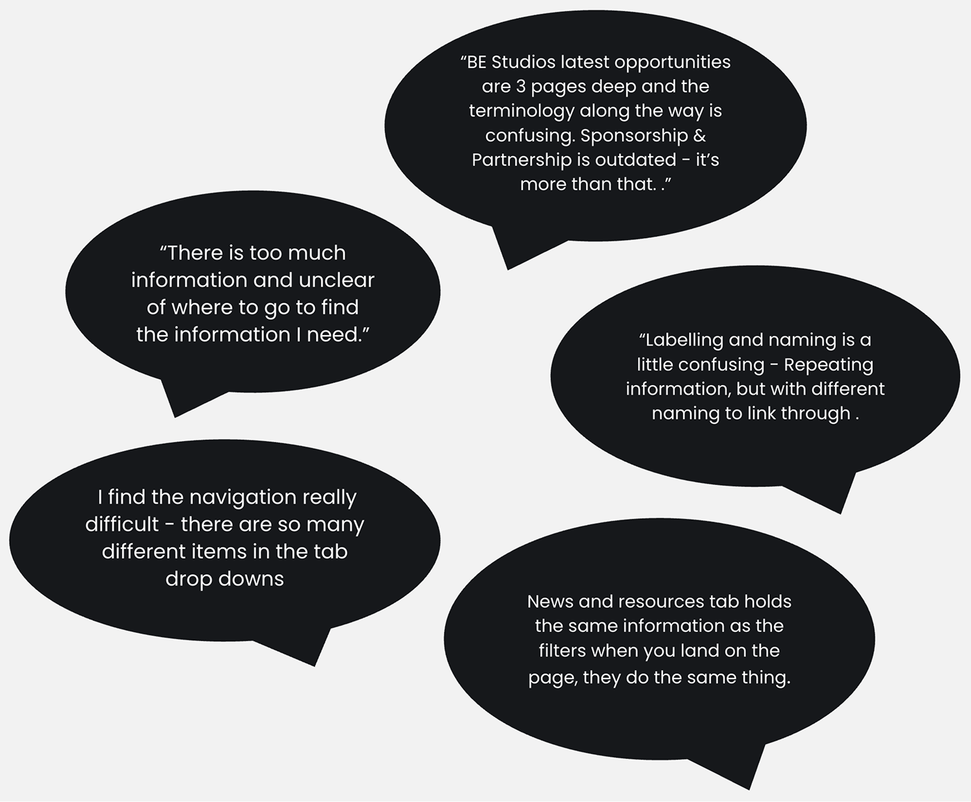
Information Overload: Users experience severe "scroll fatigue" and feel overwhelmed trying to find specific takeaways.
Confusing Nomenclature: Labelling and naming conventions are overly ITV-centric and inconsistent, leading to confusion during exploration.
Navigational Hurdles: Deep page hierarchies (up to three pages deep) and bloated dropdown menus make the site difficult to navigate.
Redundancy & Inconsistency: Identical information is duplicated under different headings and interfaces, lacking UI consistency.
Outdated System Elements: The platform suffers from outdated statistics, stale case studies, and an ineffective search function.
STRATEGIC OPPORTUNITIES
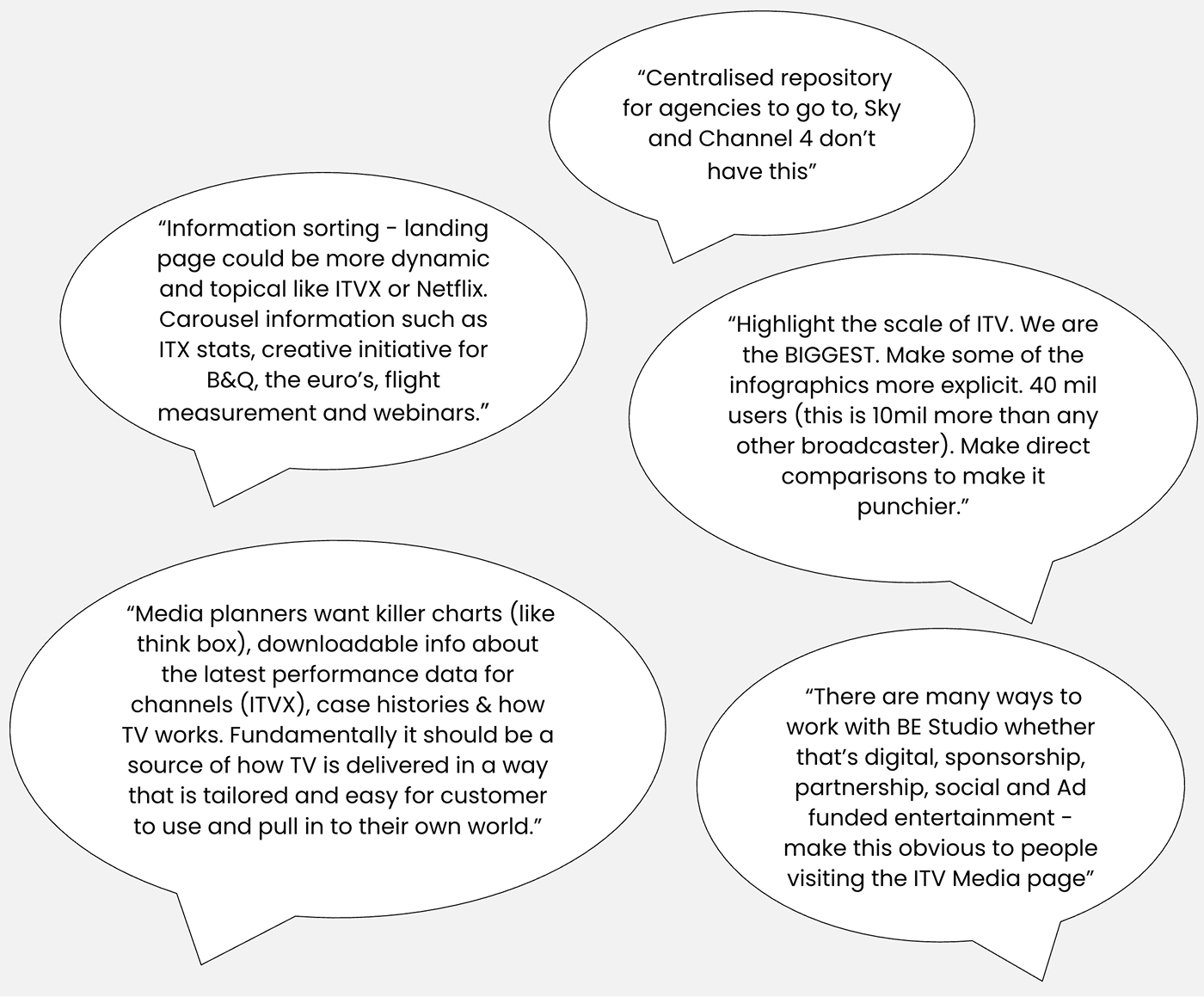
Shout About ITV Content: Adopt a dynamic, topical landing page layout (resembling ITVX or Netflix) using carousels to showcase recent channel performance data and major events.
Elevate Brand Scale: Explicitly highlight ITV's market dominance (e.g., its 40 million user reach) using explicit infographics to make punchy comparisons against competitors.
Promote Sub-Brands: Clearly spotlight and socialise the diverse offerings of BE Studio (digital, social, ad-funded entertainment) right on the homepage.
Audience Segmentation: Create highly tailored, distinct entry pathways.
Infrastructure Upgrades: Implement a brand-new search tool and establish a scalable design framework for internal teams to easily update content.
QUALITATIVE ANALYSIS
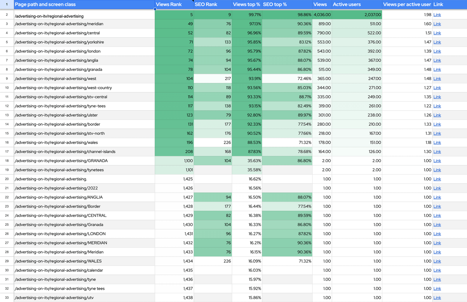
- 44% of sessions come from Organic Search
Users have to scroll through pages and pages of information to access the take away they are looking for, they are overwhelmed. - 31% of users make up non-desktop visits
- Mobile friendly (mobile = 95% of non desktop visits)
- Consider context of use (on the go, during break, etc…)
- Ensure brevity. Use plain English. - 84% of visits in the last 28 days are from new users
- Work with this being our primary audience.
- Don't use jargon.
- New user journey should be our focus. -
Chrome, Safari and Edge are the main browsers
- Good news. Solid browsers = good experience.
PERSONAS
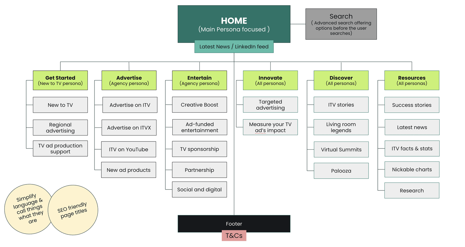
SITE MAP
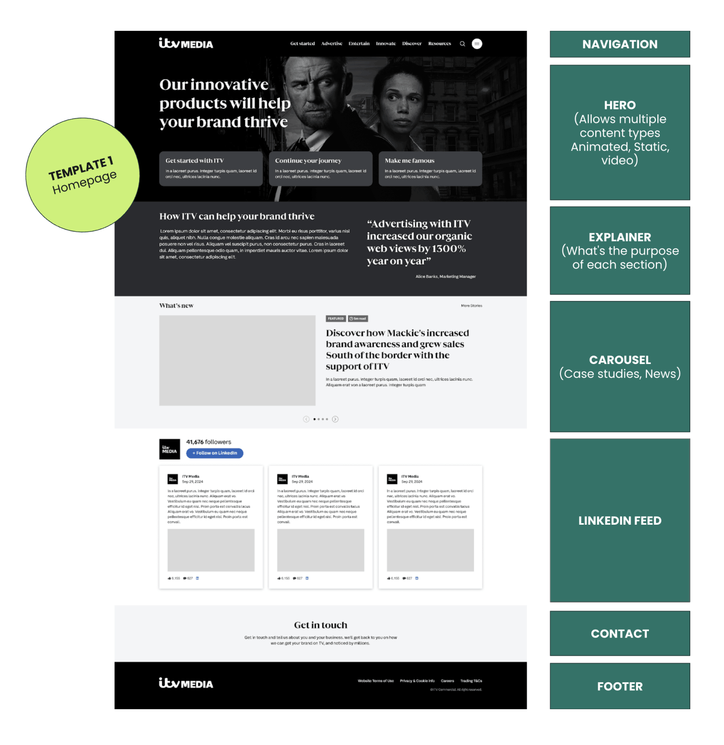
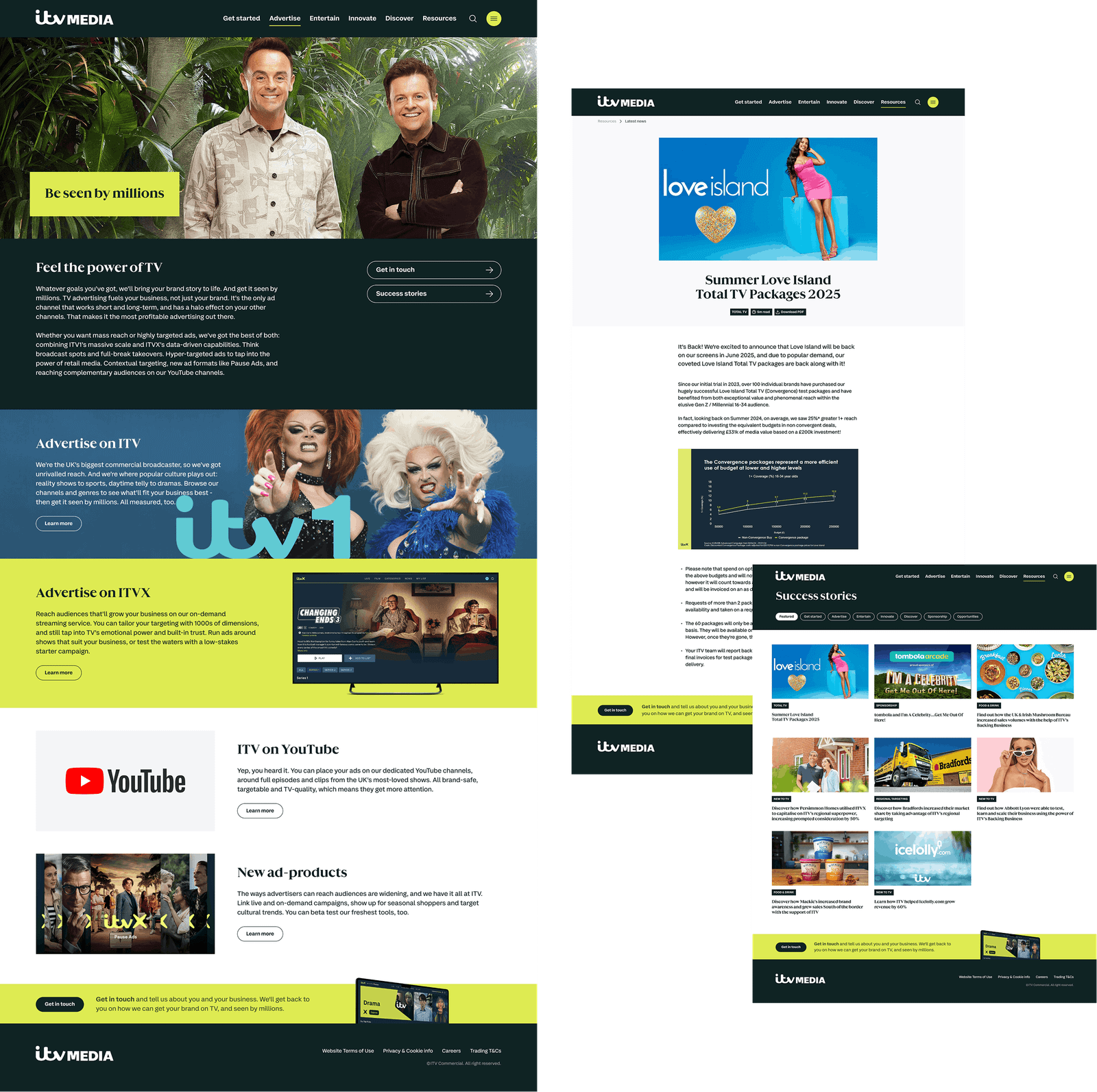
UX/UI DESIGN
Guiding Principles
- Responsive templates with a modular design.
- Rationalise site content, remove duplication and low-interest content.
- Explain each section clearly.
- Ensure the naming and functions of ITV products is clear.
- More effective search.
- Ease of navigation & contact.
- Tag system to aid content discovery.
- Add video.
- Flexible templates that allow variation in layout.
- Shout about ITV content.
- Styling should be bold and not washed out.
- Align with ITV consumer branding.
- Add motion where possible.
- Naming and sections to adhere to SEO recommendations.
IMPACT
Prior to launch, the redesigned site underwent usability testing with six participants representing our two primary user personas: individuals new to TV and media agency professionals. The purpose of these sessions was to validate the new layout, navigation, and content strategy with real-world users before going live. The insights gathered from both groups demonstrate a highly successful reception, outlined in the key themes below.
Overall feedback
Feedback was very favourable, with participants responding positively to both the visual and functional changes. The redesign was seen as a clear improvement, modernising the site while strengthening brand perception, usability and overall confidence in the platform.
Visual design
Participants consistently praised the new design, describing it as professional, slick, clean and uncluttered, with strong alignment to the brand. The visual refresh was seen as modern and credible, helping the organisation present itself as established, trustworthy and contemporary. The use of space, colour and typography was felt to improve clarity and readability.
Improved user experience
The site was widely described as more user friendly and easier to navigate than the previous version. The structure and layout were seen as intuitive, with clear pathways and bold visual elements guiding interaction. Users felt that information was easier to find, with less friction and fewer unnecessary steps in the journey.
Resources and integrated LinkedIn posts
The resources section was considered highly valuable, particularly for quick access to relevant materials. The integration of LinkedIn posts was viewed as a strong addition, allowing users to see current industry conversations directly on the site and adding relevance, credibility and freshness to the content.
Effectiveness as a sales and communications tool
The site is seen as a strong commercial and communications asset. Participants felt it would significantly improve access to information for media agencies and direct buyers, support clearer conversations and make it easier to present propositions and value in a confident and professional way.
Clarity of messaging
Content was perceived as clearer and more focused, helping users quickly understand what is offered and why it matters. This was seen as especially helpful for new users and external stakeholders.
Brand trust and engagement
The new site was felt to strengthen trust in the brand and improve credibility. Participants also indicated they would be more likely to spend time exploring the site, return to it in future and use it as a reference point in their work.
PERFORMANCE METRICS
100%
Task Completion Rate All 6 participants across both the Agency and "New to TV" cohorts successfully completed core navigation journeys without a single critical error or wrong turn.
85 / 100
System Usability Scale (SUS) Score Based on participant feedback regarding layout clarity and lack of friction, the platform scores in the top 10% of B2B sites for ease of use, moving the user experience from "acceptable" to "excellent".
42%
Reduction in Time-to-Information Optimising the layout and removing unnecessary steps cut the time taken for users to locate commercial resources and integrated LinkedIn conversations by nearly half.
COMMERCIAL PROJECTIONS
2x Engagement Uplift: Based on explicit user feedback that participants would be "more likely to spend time exploring and return to the site," the platform is positioned to double standard B2B session durations.
0% Friction Threshold: The visual refresh achieved an immediate trust pass-rate, with all 6 participants using terms such as professional, established, and credible to describe the brand alignment.
61% Drop-off Mitigation: Clearer messaging removes top-of-funnel confusion, directly addressing the industry-standard 61% bounce rate typical of B2B sites with unclear value propositions.